|
|
Critique By:
The Pilgrim (K:64983)

4/28/2024 6:38:03 PM
Nice job on this one Nigel.
Excellent PP work. Very nice textures
and tones.
Paul
|
| Photo By: Nigel Watts.
(K:5180)
|
|
|
Critique By:
Shirley D. Cross-Taylor (K:174022)
4/26/2024 12:31:05 PM
Thank you, Rohan! :)
|
| Photo By: Shirley D. Cross-Taylor
(K:174022)
|
|
|
Critique By:
Rohan Sachdeva (K:7735)
4/26/2024 3:23:50 AM
prior take. not so close. a little far away.
|
| Photo By: Rohan Sachdeva
(K:7735)
|
|
|
Critique By:
Rohan Sachdeva (K:7735)
4/25/2024 3:56:43 AM
great photograph. nice to see.
|
| Photo By: Shirley D. Cross-Taylor
(K:174022)
|
|
|
Critique By:
Shirley D. Cross-Taylor (K:174022)
4/24/2024 3:28:22 PM
Thank you for your prayers. Jim is looking forward to the surgery, hoping to feel better.
|
| Photo By: The Pilgrim
(K:64983)
|
|
|
Critique By:
Shirley D. Cross-Taylor (K:174022)
4/24/2024 3:23:58 PM
Your eye doctor, saying you had the eyes of a 90 yea r old.
|
| Photo By: The Pilgrim
(K:64983)
|
|
|
Critique By:
Shirley D. Cross-Taylor (K:174022)
4/24/2024 3:21:38 PM
Thank you so much, Paul! :)
|
| Photo By: Shirley D. Cross-Taylor
(K:174022)
|
|
|
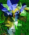
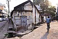
Critique By:
The Pilgrim (K:64983)
4/24/2024 11:42:03 AM
Makes for a lovely abstract Nigel!
|
| Photo By: Nigel Watts.
(K:5180)
|
|
|
Critique By:
The Pilgrim (K:64983)
4/24/2024 11:40:46 AM
Wow Shirley that one huge kite! Very lovely composition
and mood! Thanks for sharing!
|
| Photo By: Shirley D. Cross-Taylor
(K:174022)
|
|
|
Critique By:
The Pilgrim (K:64983)
4/24/2024 11:16:07 AM
Thank you Nigel. Deeply appreciated it!
|
| Photo By: The Pilgrim
(K:64983)
|
|
|
Critique By:
The Pilgrim (K:64983)
4/24/2024 11:13:41 AM
Thank you my kind friend!
|
| Photo By: The Pilgrim
(K:64983)
|
|
|
Critique By:
The Pilgrim (K:64983)
4/24/2024 11:09:23 AM
Thank you so much Shirley!
Best wishes...
Paul
|
| Photo By: The Pilgrim
(K:64983)
|
|
|
Critique By:
The Pilgrim (K:64983)
4/24/2024 11:06:01 AM
Whos comment was not nice?
|
| Photo By: The Pilgrim
(K:64983)
|
|
|
Critique By:
The Pilgrim (K:64983)
4/24/2024 11:05:11 AM
Im so sorry to hear that Shirley. I will definitely
Keep you both in my prayers....
|
| Photo By: The Pilgrim
(K:64983)
|
|
|
Critique By:
claudio amato (K:-66)
4/24/2024 9:36:58 AM
how are you?
|
| Photo By: claudio amato
(K:-66)
|
|
|
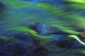
Critique By:
mariza lementowski (K:4596)
4/24/2024 9:07:36 AM
original and interesting capture!congratulation!
|
| Photo By: James Fraser
(K:941)
|
|
|
Critique By:
mariza lementowski (K:4596)
4/24/2024 3:48:09 AM
lovely capture!
|
| Photo By: Nigel Watts.
(K:5180)
|
|
|
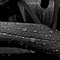
Critique By:
mariza lementowski (K:4596)
4/24/2024 3:38:45 AM
beautiful Macro raindrops on a leaf! I would love to see it also on natural green leaf; thanks for a visit; greetings from Florida, Mariza
|
| Photo By: Nigel Watts.
(K:5180)
|
|
|
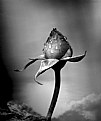
Critique By:
mariza lementowski (K:4596)
4/23/2024 10:22:18 PM
realistic and touching!great shot! well deserved the Prize =7=
|
| Photo By: Rohan Sachdeva
(K:7735)
|
|
|
Critique By:
mariza lementowski (K:4596)
4/23/2024 8:36:52 PM
thank you so much, Michele; greetings from Florida
|
| Photo By: mariza lementowski
(K:4596)
|
|
|
Critique By:
mariza lementowski (K:4596)
4/23/2024 8:26:13 PM
Dancing under the water!very artistic =7=
|
| Photo By: Maria Michalina
(K:890)
|
|
|
Critique By:
mariza lementowski (K:4596)
4/23/2024 3:49:53 PM
Thank you for your visit, and kind comment.
|
| Photo By: mariza lementowski
(K:4596)
|
|
|
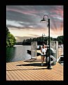
Critique By:
Shirley D. Cross-Taylor (K:174022)
4/23/2024 3:04:49 PM
Very cool shot, Paul! 
|
| Photo By: The Pilgrim
(K:64983)
|
|
|
Critique By:
Shirley D. Cross-Taylor (K:174022)
4/23/2024 3:00:33 PM
Beautiful, Nigel!
|
| Photo By: Nigel Watts.
(K:5180)
|
|
|
Critique By:
Shirley D. Cross-Taylor (K:174022)
4/23/2024 2:59:48 PM
Very nice photo, Steven.
|
| Photo By: Steven Hackett
(K:1692)
|
|
|
Critique By:
Shirley D. Cross-Taylor (K:174022)
4/23/2024 2:58:29 PM
A beautiful moody photo, Mariza! :)
|
| Photo By: mariza lementowski
(K:4596)
|
|
|
Critique By:
Shirley D. Cross-Taylor (K:174022)
4/23/2024 2:56:27 PM
Lovely photo, Igor.
|
| Photo By: Igor Gordobayev
(K:2558)
|
|
|
Critique By:
Shirley D. Cross-Taylor (K:174022)
4/23/2024 1:23:31 PM
Thank you so much, Nigel! :)
|
| Photo By: Shirley D. Cross-Taylor
(K:174022)
|
|
|
Critique By:
Shirley D. Cross-Taylor (K:174022)
4/23/2024 1:21:30 PM
Thank you so much, Mariza! :)
|
| Photo By: Shirley D. Cross-Taylor
(K:174022)
|
|
|
Critique By:
Shirley D. Cross-Taylor (K:174022)
4/23/2024 1:20:58 PM
Thank you so much, Mariza! :)
|
| Photo By: Shirley D. Cross-Taylor
(K:174022)
|
|