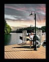
Usefilm Home Sign Up Now! | Log In | Help  

Film and Digital Photography

 
User Activity
Image Summary
Awards Received
Portfolio Summary
Critiques from Sunset
Critiques to Sunset

Portfolios
Favorites (89)
Miscellaneous (12)
Multi-Images (19)
Sea Shells (28)
Sunsets (86)
Tribute to Ansel (19)

Categories
Alternative Process (3)
Architecture (6)
Cityscape (5)
Commercial (1)
Deep Blue (2)
Florals (5)
Historical (1)
Journalism (1)
Landscape (67)
Minimalist (1)
Nature (72)
Others (1)
Panoramic (14)
People (2)
Pets (2)
Photoart (13)
Scientific (2)
Seascapes (14)
Still Life (29)
Transportation (1)
Wildlife (14)


Critiques From Sunset Man


  1  2  3  4  5  6  7  8  9    >


Critique By: Sunset Man  (K:10972) Donor  
11/30/2009 4:28:04 AM

We could smooth this wonderfully colourful image out a bit more for that painterly feel but how can the ~SUNSET MAN~ not like this 'As Is' also ...
        Photo By: Ryca Rawung  (K:980)

Critique By: Sunset Man  (K:10972) Donor  
11/29/2009 11:22:22 PM

Absolutely amazing image especially the bottom half with it's clarity so I can't imagine why no one has commented on it before now ...
        Photo By: Turi cg  (K:5806) Donor

Critique By: Sunset Man  (K:10972) Donor  
11/29/2009 11:19:04 PM

Well at least I can catch you on one that is wrong unless there is a 'Fiascherino' in the United States that I don't know about since you marked the Country where the picture was taken as U.S. at least with our Flag! :))
        Photo By: DUZ Image  (K:6)

Critique By: Sunset Man  (K:10972) Donor  
11/29/2009 10:49:54 PM

P.S. I really hope I didn't 'Burst Your Bubble or Sink Your Ship' with my honest and constructive critique because I really do like the basic idea especially because the water must have been absolutely freezing this time of year of there! :))
        Photo By: DUZ Image  (K:6)

Critique By: Sunset Man  (K:10972) Donor  
11/29/2009 10:41:49 PM

First of all I thought there was a 'typo' in the title when it possibly should have been 'Self Portrait' until I opened up the thumbnail! :))

Anyway ... A great set up as you dictate, but the composition is all wrong in my opinion which should have been a Square Format' instead of 'Squeezed Vertical' so let me show you what I mean with the attached.

Additionally, I clarified the image besides the much needed cropping and then added a simple 'Presentation Border' ...

Hope you like it even better and please do give my Best of regards to the 'Crew' who 'Engineered' this!
        Photo By: DUZ Image  (K:6)

Critique By: Sunset Man  (K:10972) Donor  
11/29/2009 9:22:49 PM

Hey Kevin: You are 'Featured Staff Choice' with this image today - November 29th - Hawaiian Time at least! :)) Congrats ...
        Photo By: KEVIN TEMPLE  (K:8135) Donor

Critique By: Sunset Man  (K:10972) Donor  
11/29/2009 9:18:34 PM

It is quite clear and 'Playful' at that with great macro work. Thanks for the bit of humour also Ivona! :))
        Photo By: Ivona Lozic  (K:6261) Donor

Critique By: Sunset Man  (K:10972) Donor  
11/29/2009 9:14:55 PM

No wonder he is dressed up as he is because it must have been freezing and all for clams possibly not worth eating as you stated. Back to 'Good Old Fettuchine' I guess without the 'Main Ingrediant' ... ! :))
        Photo By: Gennaro Guarino  (K:12331)

Critique By: Sunset Man  (K:10972) Donor  
11/29/2009 8:54:45 PM

P.S. Translation of the 'Title' please ... Thanks in advance!
        Photo By: Gennaro Guarino  (K:12331)

Critique By: Sunset Man  (K:10972) Donor  
11/29/2009 8:48:44 PM

Gennaro ...

Thanks for the 'Double' explanation to Riny :)) and that really answers my question also, but what I don't understand with the great DOF here purposely is that the ratings do NOT 'Match' the comments at all, so something is wrong therefore I will help you make up for it with an 'Honest' 6 ... Okay?

Best of Regards!
        Photo By: Gennaro Guarino  (K:12331)

Critique By: Sunset Man  (K:10972) Donor  
11/29/2009 8:24:37 PM

'Beauty' ... Yes, but also too 'Soft' for my taste ... You can understand what I mean ... Right?
        Photo By: Andriete Le Secq  (K:66)

Critique By: Sunset Man  (K:10972) Donor  
11/29/2009 7:16:56 PM

You are most welcome Kenan, but you know that I am not that good much less worth visiting ... Right?
        Photo By: Kenan Pajević   (K:1739)

Critique By: Sunset Man  (K:10972) Donor  
11/29/2009 5:53:21 PM

I really fell sorry for the dog way back in the corner directly behind 'his' right shoulder ...
        Photo By: Atish Sen  (K:5962)

Critique By: Sunset Man  (K:10972) Donor  
11/29/2009 5:50:44 PM

Absolutely terrible image by meaning and oversharpness but the B&W should have worked more perfectly so please reload this with grain instead ...
        Photo By: abhik bhattacharya  (K:1169)

Critique By: Sunset Man  (K:10972) Donor  
11/29/2009 5:33:16 PM

Kenan: 'Credit where Credit is Due' ... Keep shooting and you are always more than welcome to visit my Portfolio especially the 'Miscellaneous Folder' of 'Neglected' images which I like a lot like lost 'Orphans' ... ! :))

P.S. Your image here belongs right in the middle of the 'Living Room' somewhere!
        Photo By: Kenan Pajević   (K:1739)

Critique By: Sunset Man  (K:10972) Donor  
11/29/2009 5:24:41 PM

P.S. That "Afghan Girl" that is on the 'Front Cover' of his book I mentioned and which originally appeared in NATIONAL GEOGRAPHIC in the June 1985 Issue just really put him 'Over the Top' didn't it?
        Photo By: Avi    (K:67704) Donor

Critique By: Sunset Man  (K:10972) Donor  
11/29/2009 5:15:22 PM

I think it is a bit oversharpened but I really like the B&W effect and photojournalistic idea ...
        Photo By: sanjoy Bose  (K:1676)

Critique By: Sunset Man  (K:10972) Donor  
11/29/2009 5:08:00 PM

Aloha Avi (via txules),

1. I'm just wondering first of all whatever happened to boring.day.3? ...

2. Secondly I do think txules is 'Pampering' you ...

3. As for Nick ... Well he is a 'Scientific Genius' in his own mind so I don't really care about him reading my comments!:))

4. And this is the 'BIG ONE': How interesting that you personally have been acquainted with THE Mr. Steve McCurry, (Born February 24th, 1950 - Author of the book titled "PORTRAITS" published by PHAIDON Printed in Hong Kong First Published in 1999), but he is based in New York and does give weekend workshops there which is where you live so I believe all of it!

5. Next and final: I have just put up an image titled "GOING HOME" which you may want to take a look at especially because it is 'Dedicated' to you ...

Best of Regards!
        Photo By: Avi    (K:67704) Donor

Critique By: Sunset Man  (K:10972) Donor  
11/29/2009 3:56:16 PM

Kind of early for New Years isn't it?:)) Lovely play with colours ...
        Photo By: Marian Man  (K:73860)

Critique By: Sunset Man  (K:10972) Donor  
11/29/2009 2:01:32 PM

The comments do not match the ratings ... something is wrong here!
        Photo By: Kallol Majumdar  (K:16968)

Critique By: Sunset Man  (K:10972) Donor  
11/29/2009 4:10:19 AM

Very clever indeed but how did you stay out of the image especially with the lens used which I just love also every dollar of it? Good choice for monochrome of course too ...
        Photo By: Keith Saint  (K:12981) Donor

Critique By: Sunset Man  (K:10972) Donor  
11/29/2009 2:10:26 AM

A B S O L U T E L Y - G O R G E O U S ! Perfect composition, lighting, and detail ...
        Photo By: TUBA DURAN YARAN  (K:2761)

Critique By: Sunset Man  (K:10972) Donor  
11/28/2009 8:01:23 PM

Just gorgeous overall but I would tone down the sun ever so slightly although it does indeed warm up these old bones of mine ...
        Photo By: Alberto Romano  (K:2740) Donor

Critique By: Sunset Man  (K:10972) Donor  
11/28/2009 7:48:34 PM

Welcome to UF Andriete ...

This is a very nice feminine portrait for some obvious reasons and then of course how the cigarette is being also. While the B&W is what immediately attracted me among other things of course is her hidden 'right eye', but I wondered if there is lost detail or not. So, I lightened the whole scene and wasn't satisfied therefore I went reverse and added even more contrast to hide that eye in even a more mysterious sort of way. I also took a bit off the vertical borders off both sides and then softened the image even more because I didn't think the slight grain worked giving the skin a smoother texture. A simple border just kind of finished it all off. Hope you don't mind and like it even more ...
        Photo By: Andriete Le Secq  (K:66)

Critique By: Sunset Man  (K:10972) Donor  
11/28/2009 7:19:10 PM

I don't know what this symbol means as it pertains to this image, but it is a very good circular abstract with great color, detail, and perfectly composed almost into a 'Square Format'. Because there are five spikes shouldn't there be five 'Exclamation Marks' also in the title instead of four? :))
        Photo By: aZiZ aBc  (K:26044)

Critique By: Sunset Man  (K:10972) Donor  
11/28/2009 7:13:59 PM

This is yet another very good Architectural image with great color and clarity in a 'National Geographic' way and the shadow in the bottom righthand corner actually works to your advantage for perfectly placed 'Typo Credits' ...
        Photo By: jacques brisebois  (K:70473)

Critique By: Sunset Man  (K:10972) Donor  
11/28/2009 4:06:20 AM

Your current image titled "HANDS" of course brought me to this one which I think is even much more powerful ...
        Photo By: luis pereira  (K:22562) Donor

Critique By: Sunset Man  (K:10972) Donor  
11/28/2009 3:09:30 AM

Very soothing composition and duration of exposure ...
        Photo By: Zbylu    (K:577)

Critique By: Sunset Man  (K:10972) Donor  
11/28/2009 2:40:27 AM

Aloha Kenan,

Thank you for the invitation to visit this very fine image of yours. Very placid and with a warm halo around the sun. Although the horizon may be just a bit off and perhaps very minor detail has been lost I believe both have been corrected in the attached which is now most certainly ready for hanging.

Thanks so much for sharing and your most recent comments on my own work and because of that your name has been added to the 'Dedication Lists' of both of these:

http://www.usefilm.com/image/1044571.html
http://www.usefilm.com/image/1059087.html
        Photo By: Kenan Pajević   (K:1739)

Critique By: Sunset Man  (K:10972) Donor  
11/27/2009 9:23:52 AM

1. Jan has corrected you properly with the 'Title' as I had originally remarked! :))

2. Additionally, it has been my long belief for 30 some years now that if the 'Main Attraction' is 'Centered' then the 'Over-All Image' should perhaps be 'Square Formatted' per the attached with an 'Artistic Presentation' which I have utilized twice this evening (Hawaiian Time) with yours and Ryca's earlier.

Let me know what you think and keep in mind that I would not have spent so much time on this piece of work of yours if I did not like it ...

Best of Regards!

~Sunset Man~
        Photo By: Wolf Zorrito  (K:41772) Donor


  1  2  3  4  5  6  7  8  9    >


|  FAQ  |  Terms of Service  |  Donate  |  Site Map  |  Contact Us  |  Advertise  |

Copyright ©2005 Photo Publishing Group, LLC - All Rights Reserved

Elapsed Time:: 1.921875